15 Inspiring Healthcare Website Designs (In 2023)
 Mukarram Mugal
In this post, we will show you 15 great healthcare website designs from 2023. They are visually appealing, easy to use, and professional.Â
If you are a medical professional, clinic, or working in the healthcare industry, these designs can inspire you to create a great website for your own business.
Healthcare website design is not just about looks.It is also about building trust and credibility with patients.
Patients need to feel confident in their healthcare providers.
A well-designed website can create a professional and trustworthy atmosphere.This can make patients feel more secure and well-cared for.
Feeling excited to check out the best healthcare website designs ?
Â
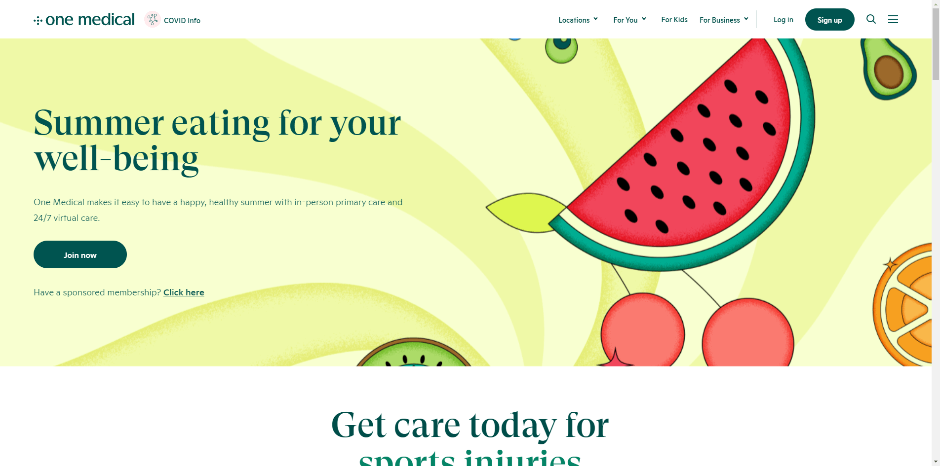
1. One Medical: Weaving Stories through Design
One Medical captures attention with contrasting CTA buttons and captivating text effects. Embedded videos add depth to the content presentation. A location finder in the footer simplifies information access, while a link to "locations" in the floating navbar facilitates navigation.
Reason -Â Contrasting buttons, captivating effects, videos.
Build with - WagtailÂ
Â
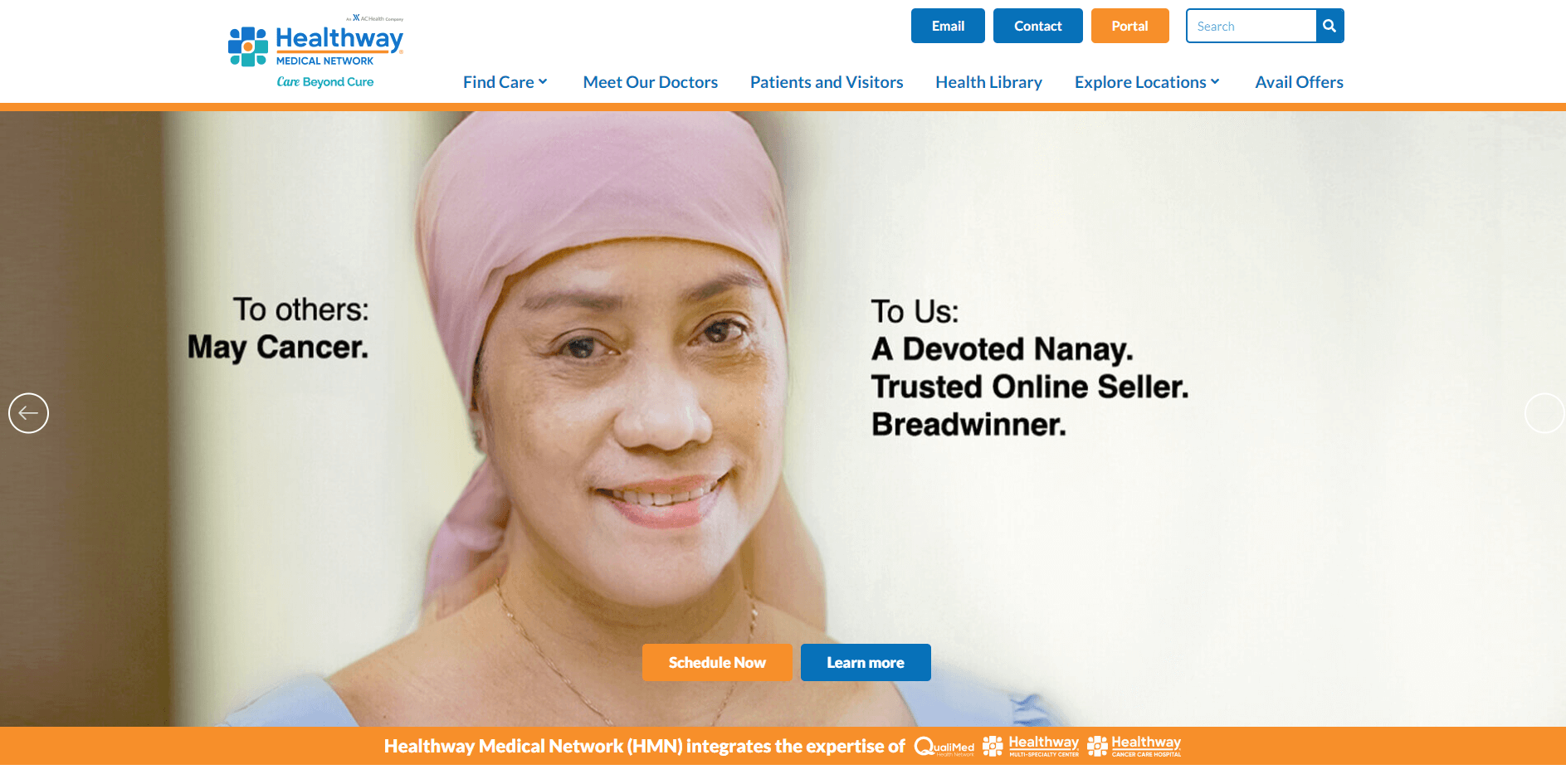
2. Healthway: The Marriage of Modernity and Readability
Healthway's website stands out with its contemporary aesthetics and judicious use of white space. The parallax effect injects an element of depth, while the clever interplay of clean design and creative embellishments creates an ambiance that is both modern and inviting.
Reason -Â Modern design, ample white space, and parallax effect enhance user experience.
Build with - SquarespaceÂ
Â
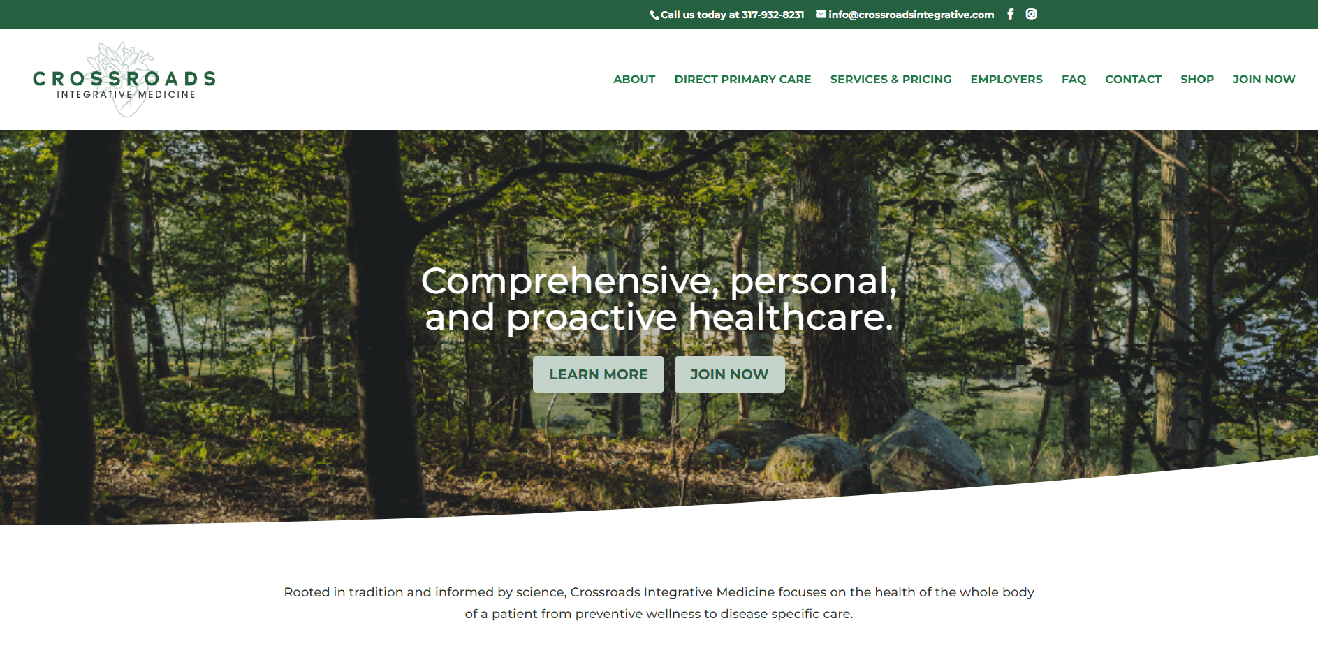
3. Crossroads Integrative Medicine: Calmness Embodied in Green
Crossroads Integrative Medicine embraces a tranquil green color palette to evoke a sense of calm. The floating header and back-to-top button enhance user navigation. A testament to thoughtful design lies in the animation elements, infusing vibrancy into the interface.
Reason - Soothing green palette, floating elements.
Build with - Divi
Â
4. Halcyon Health: Where Elegance Meets Minimalism
Halcyon Health masterfully employs minimalism to convey elegance. A generous-sized banner featuring a compelling call-to-action button immediately draws attention. The finesse of the design lies in its subtle hover effects that engage users, all within an uncluttered layout.
Reason - Elegant minimalism and user interaction drive engagement.
Build with - SquarespaceÂ
Â
5. Integrative Medicine of NYC: Nurturing Trust through Transparency
An arresting hero image and a prominent booking CTA button take center stage on the Integrative Medicine of NYC website. The floating header ensures that vital menu links and contact details remain ever-present. Testimonials thoughtfully placed on the homepage foster a sense of trust, further substantiated by the integration of Google Maps for convenient location finding.
Reason - Transparent testimonials and trust-building elements.
Build with - SquarespaceÂ
Â
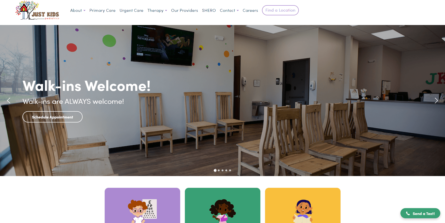
6. Just Kids Pediatrics: Showcasing Options with Panache
Just Kids Pediatrics employs a slider to deftly present multiple options, offering users a swift overview of services. The integration of Google Reviews augments the clinic's credibility. The website's strength lies in its user-centric design, facilitating easy access to essential information.
Reason -Â Slider for quick service overview, integrated Google Reviews.
Build with - SquarespaceÂ
Â
7. Vigor Natural Health Clinic: A Tranquil Oasis in Design
The Vigor Natural Health Clinic website immerses visitors in a serene ambiance through its light design and harmonious color palette. The consistent use of a single background color across the header, base, and footer creates a sense of cohesion. The incorporation of Google Maps enhances user experience by making clinic location easily accessible.
Reason -Â Calming design, unified color palette.
Build with - SquarespaceÂ
Â
8. Maven Clinic: Navigational Finesse at its Best
Maven Clinic's design radiates warmth through its inviting color palette. The floating top bar and responsive header enhance navigation convenience. The hero area's "search" function expedites topic exploration, ensuring that users access desired information promptly.
Reason - Friendly palette, floating top bar, quick search.
Build with - WebflowÂ
Â
9. Flatiron Family Medical - A Journey through Parallax
Flatiron Family Medical's website showcases modernity via the dynamic parallax effect and engaging sidebar navigation. The newsletter subscription form strategically placed between sections captures leads for effective email marketing. The header and footer, while plain, are laden with essential links, CTAs, and social icons.
Reason - Parallax sections, sidebar navigation.
Build with - SquarespaceÂ
Â
10. Felix Medical Group: The Art of Simplified Organization
Â
Felix Medical Group's website boasts an organized layout characterized by simplicity and ample white space. The integration of Google Maps and a clickable phone number expedites communication and location discovery. The focus on user-friendliness is evident, creating a seamless experience.
Reason - Organized simplicity, user-friendly.
Build with - WebflowÂ
11. Synergy Private Health: Crafting Immersive ExperiencesÂ
Synergy Private Health's slideshow and transparent header work in tandem to create an immersive journey for visitors. The continuous content loading while scrolling enhances engagement, making for an interactive experience.
Reason - Immersive slideshow, transparent header.
Build with - SquarespaceÂ
Â
12. SimplePractice: Encouraging Engagement through Action
SimplePractice maximizes user interaction with an actionable above-the-fold section. The mega menu and opt-in form contribute to a seamless user journey. The incorporation of certification badges and video content adds dynamism.
Reason - Above-the-fold action, video content.
Build with - GatsbyÂ
Â
13. Northwestern Medicine: Accessible Design for All
Northwestern Medicine prioritizes accessibility, ensuring that critical links and CTAs remain within easy reach. The floating elements, including the header and animated statistics, enhance user engagement. Thoughtful animations inject a touch of vibrancy into the interface.
Reason -Â Accessible links, engaging animations.
Build with - SiteCoreÂ
Â
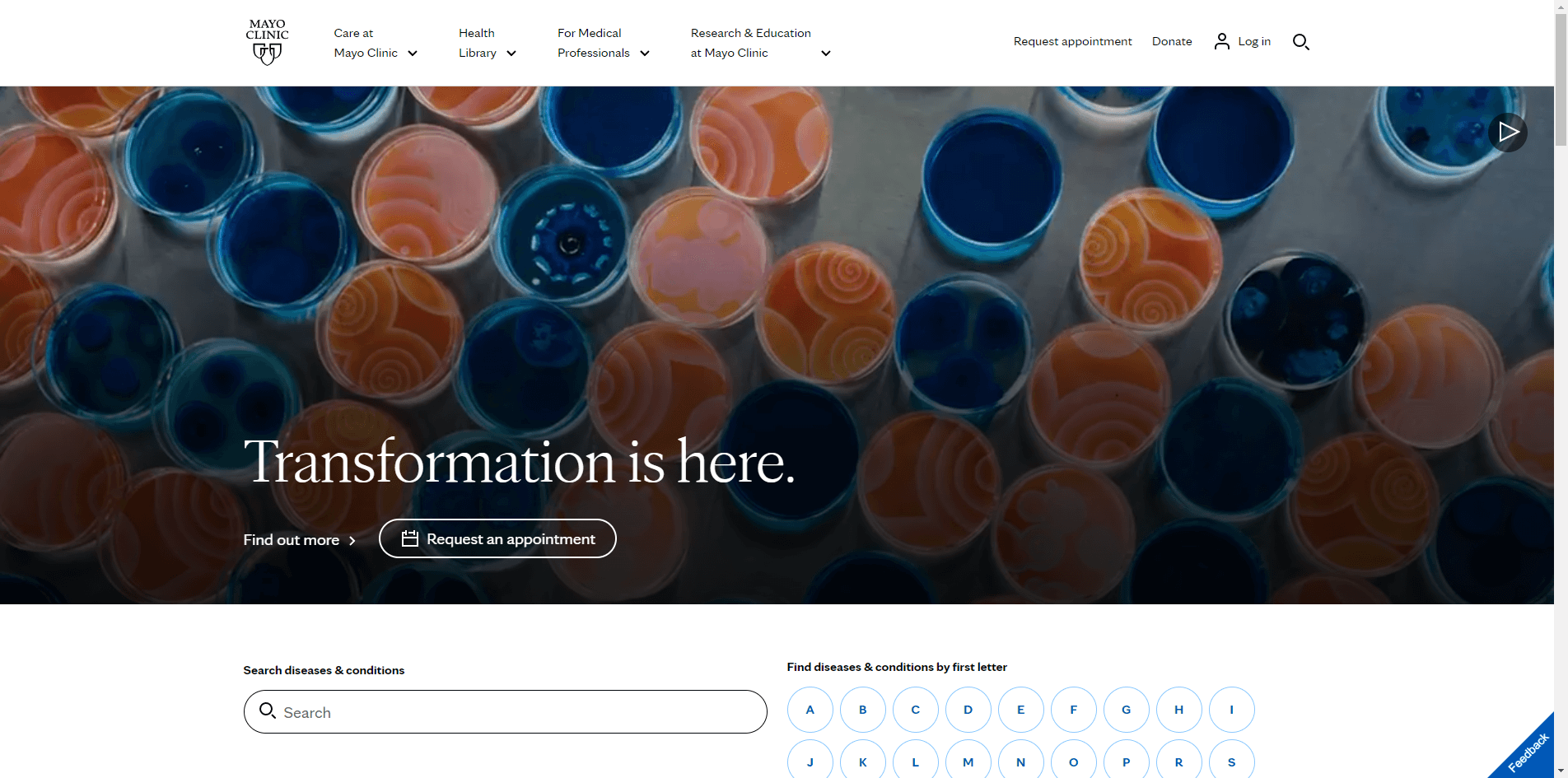
14. Mayo Clinic: Minimalistic Mastery for Optimal UX
Mayo Clinic embraces minimalism, optimizing the user experience by focusing on content and readability. The "feedback" button's placement encourages user engagement. The strategic interplay of white space, colors, and typography sets the tone for a sophisticated interface.
Reason -Â Minimalistic approach, content focus.
Build with - SiteCoreÂ
15. Virtua Health System: A Holistic Approach to Interface
Virtua Health System adopts a comprehensive approach with its three-part header, facilitating streamlined navigation. The floating messaging box accelerates user inquiries, and quick links in the footer ensure efficient access to information. A language switcher in the top bar caters to a diverse audience.
Reason -Â Comprehensive header, language switcher.
Build with - SiteCoreÂ
Â
Conclusion.
Healthcare websites that look good and work well are successful.
By using good design and a content management system, you can create a website that patients will like, that has useful information, and that makes your online presence more professional and credible.
Remember, good design, functionality, and a content management system are essential for a successful healthcare website.

